Diagrammatic
Space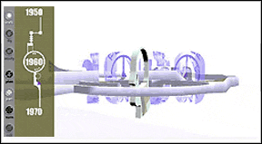 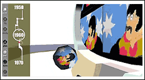 |
|
|
The
Prototype The y-axis represents time. It shows the evolution
of the social diagram and the changing (widening) domain of
cultural, economic and political spheres. Driving the overall stretching
of society, is technology. Technology creates new paths for human
existence. New abilities - flight, computer use as well as, new
jobs, and new pleasures. The world is getting broader. |
|
 |
 |
The slice on the left is the current state of society, note the broad scope of the cultural, political and economic domains. The slice on the right is the early stages of human development. Cultural, political and economic domains were heavily integrated into everyday life of individuals. |
|
 |
The model to the left is capped by the slices above. Interacting with the model forms a unique interpretable structure upon which one can envision the changes in society. |
|
Upon entering the prototype, note the buttons on the lower left. These will allow you move closer to the model and see finer levels of detail. It will also allow you to enter the model and then hidden inside that level is a button for entry into an individual life world. Overall the space is an explorable space that does utilize many of the unique abilities of three dimensional space to present data. It does not deliver on the concept of hyper euclid diagrams – or does it? |
|
[ next page ] |
|