Spatial Charts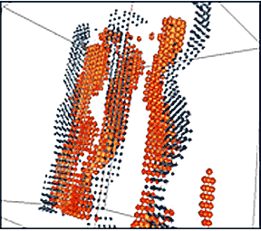 |
|
The diagram above examines the solar wind. Each point is a particle and its position is determined by its real world counterpart. Additional data, indicating vorticity and velocity is shown through changes in shape and color. This approach is perfectly reasonable for data sets that have real world counterparts such as the solar wind. Yet the amount of data actually usable by the viewer is far less then shown. It may be more helpful to group points into flowing, semi transparent forms that highlight the behavior of groups of particles. Rotating the data, viewing it from different angles may or may
not hold value to the viewer. In this regard, the addition of a
third dimension holds its greatest value for those initially seeking
(or training) to explore and understand the data. As a means of
showing relevant information to a group, a single (or perhaps series)
of images may be more defilement and effective. Granted, turning
the model and searching for the data to present may add showmanship
to the presentation, but that is a personal choice. |
Extruded
Graphs |
|
Most charts and graphs
found in corporate and academic presentations structured into bars
or plotted points and arranged on two axis. Two fundamental problems arise. Charts and graphs use simple visual comparisons to generate meaning. The ability for viewers to make comparisons based on spatial and volumetric elements are confounded by the nature of three-dimensional space. Three dimensional perspectives add volumetric and spatial data into the scene. This three dimensional data alters the visual relationships of the non spatial data that the chart or graph is supposed to highlight. Additionally, the data in this type of graph is aligned along two
straight axis drawn in a perpendicular manner. Presentation in any
position other than a straight/parallel or perhaps isometric view
to the viewer further degrades the information the designer wishes
to be understood. |
[ next page ] |